Hiring a professional photographer who knows how to ensure the colors in your project/product are accurately represented is essential. Learn how Greg West Photography achieves color accuracy.
You’ve been looking for months for the perfect hunter-green wallpaper. At last, you find one online and you click “buy.” UPS pulls up, and you excitedly open the box only to discover the wallpaper is closer to “Kelly” green. You are so disappointed and wonder - “how did this happen?”
Color is one of the most important elements that manufacturers, architects, and interior designers use when creating a design. Color helps set a mood or tone for a building or interior space. Think of Ocean blues or Teal greens.
Architects and designers spend considerable time and energy working with their clients to create a space that elicits a certain feeling. Color, form, and texture are all elements that help add to that feeling.
As a commercial photographer, it is my job to accurately convey those feelings, and the one element that I can affect the most is color.
When photographing interior spaces, we are often faced with a variety of lighting conditions:
- Daylight from windows is very blue
- Artificial light from light bulbs can range from very yellow to green in fluorescent bulbs.
- Bulbs these days come in so many varieties of color temperatures that it can make a scene very challenging to get the correct color interpretation or white balance.
The tools & techniques that we use to help solve the color problem vary. Modern-day digital cameras have numerous settings that we can change to help match the existing color in a scene, but it does not always work out the way we expect. Especially with mixed lighting types.
We also have very sophisticated software that can help us after the fact. I won’t go into details on software as each photographer has their own preferred tools.
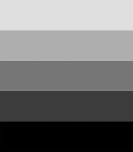
One physical item that we use on site is a "grey card" to assist with getting the correct white balance. This simple grey card seen below is made with black ink and contains a range of densities or brightness of black and is printed on matte white paper.
When placed in a scene it will be lit by whatever light source is in the room. That may be warm bulbs, daylight, or even LED lights of various colors. Once an image is captured by the camera and we have it in our software, we are able to choose a spot on the card then the software will adjust the colors to make that spot neutral in color. This will result in the whole scene shifting to the correct white balance.
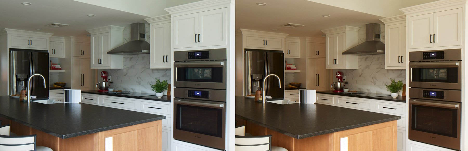
Here is a simple example of the before and after of using the grey card to adjust the white balance. Note the rather cool or blue tones on the left image of the card and the more neutral tones on the right image of the card. In this situation, we needed to color correct for the large amount of daylight that was influencing the image. We still have work to do to light the scene, but at least we have a good base color balance that we may supplement with other daylight color-balanced light sources such as flash, strobe, daylight-balanced LED, or even daylight-balanced fluorescent bulbs. The old saying that there is more than one way to skin a cat is very applicable to adding supplemental lighting to a space.
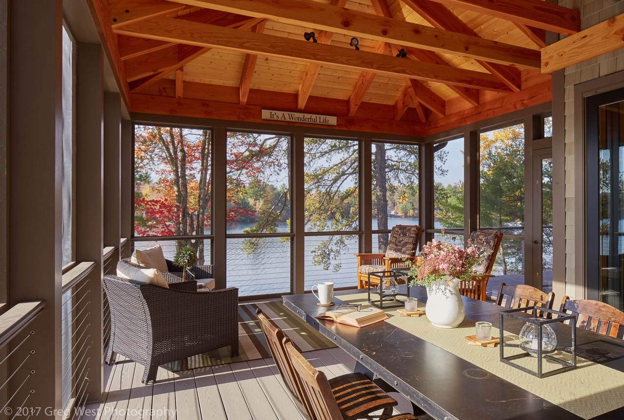
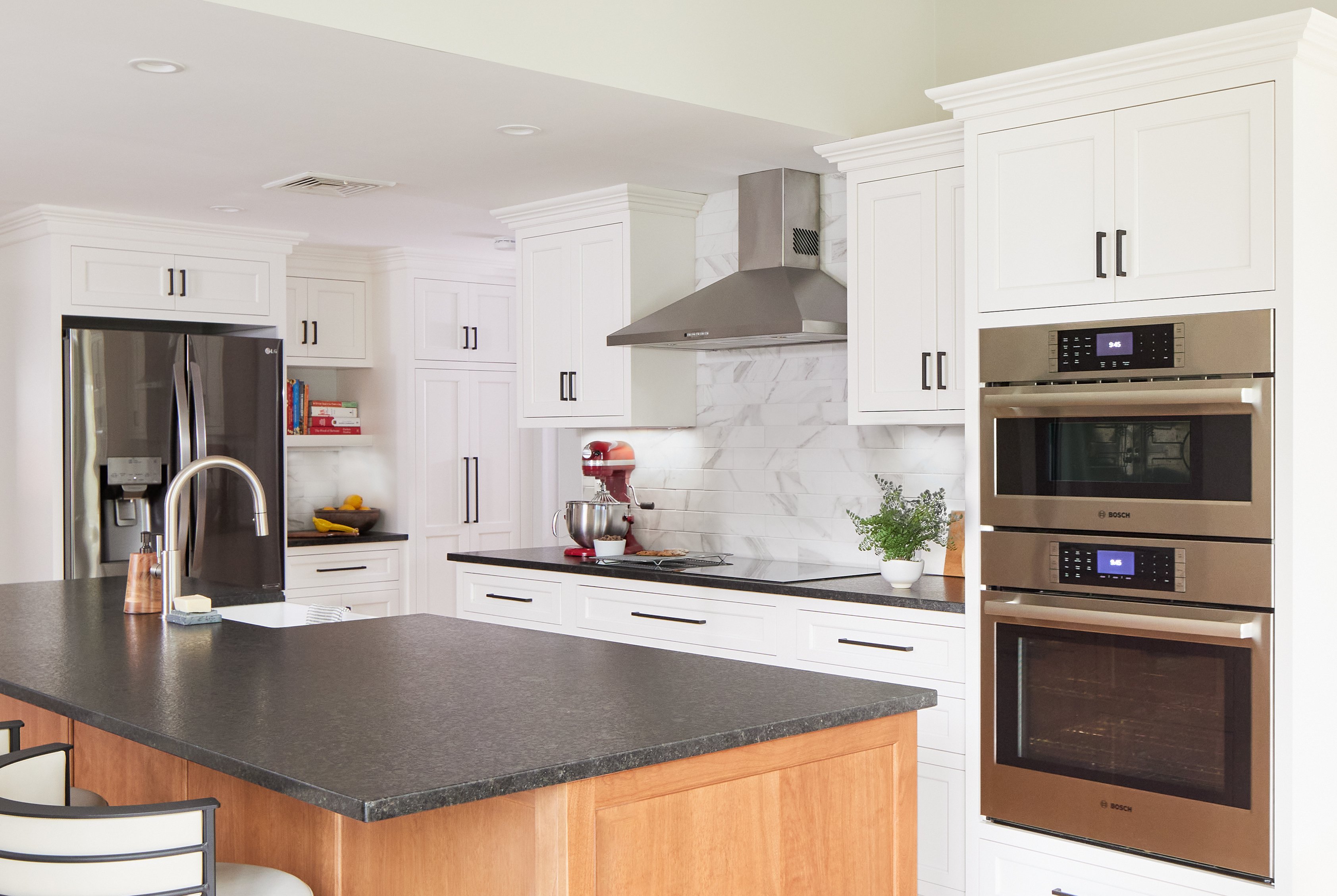
Here is the final image after we added supplemental daylight sources to match the existing daylight.
A grey card. It’s not high tech but it is a tool that is very useful to help us ensure your project or product looks the same in person as it does in the photo we create.
Would you enjoy learning more about the items in Greg’s “toolkit?” Or do you have other topics you’d like us to cover? Please comment below and be sure to follow us + subscribe to our Blog.
️